Flux Pay – Fintech Mobile App UI Kit (iOS & Android)
Flux Pay is a modern, clean, and scalable Fintech App UI Kit designed for digital wallets, payment apps, neobanks, and financial service platforms. Built with a strong focus on usability, consistency, and real-world fintech flows, Flux Pay helps designers and developers launch professional finance apps faster with production-ready UI assets.
This UI kit is ideal for startups, agencies, product designers, and SaaS teams building wallet apps, UPI-based payments, card management systems, and money transfer platforms.
Product Highlights
Modern, minimal, and clean visual style
Fully designed Light & Dark Mode
Card-based layout for clarity and scalability
Responsive grid system for iOS & Android
Smooth rounded corners with premium feel
Outline-style icon system
Finance-focused blue/green branding
Auto layout & responsive design structure
Ready-to-use prototype for major user flows
Design Style & Branding
Visual Style
Modern, minimal, and clean UI
Card-driven layouts for better content separation
Smooth rounded corners for a friendly fintech experience
Subtle shadows and spacing for depth without clutter
Color System
Primary Colors: Blue or Green (finance & trust focused)
Secondary Colors: Neutral grey tones
Optimized contrast for accessibility in both light and dark themes
Typography
Bold, confident headings
Clean and highly readable body text
Consistent hierarchy for financial data clarity
Icons & Illustrations
Outline-style icon set
Finance-themed illustrations (optional usage)
Unified stroke and spacing system
Deliverables Overview
60–100+ professionally designed screens
Full UI Components Library
Dedicated Icon Library
Complete Color & Typography Style Guide
Auto layout with responsive constraints
Clickable Prototype for major app flows
Well-organized and developer-friendly structure
Screen-Wise UI Coverage
1. Onboarding & KYC Flow
Splash Screen
Language Selection
Welcome Introduction (Carousel)
Login with Phone / Email
OTP Verification
Create Account (Basic Details)
KYC Start Screen
KYC Document Upload
Selfie Verification
KYC Pending Screen
KYC Approved Screen
2. Dashboard & Home
Main Dashboard
Wallet Balance Overview
Quick Actions Widget
Add Money
Send Money
Withdraw
Scan & Pay
Recent Transactions List
Cards Carousel
Notification Indicator
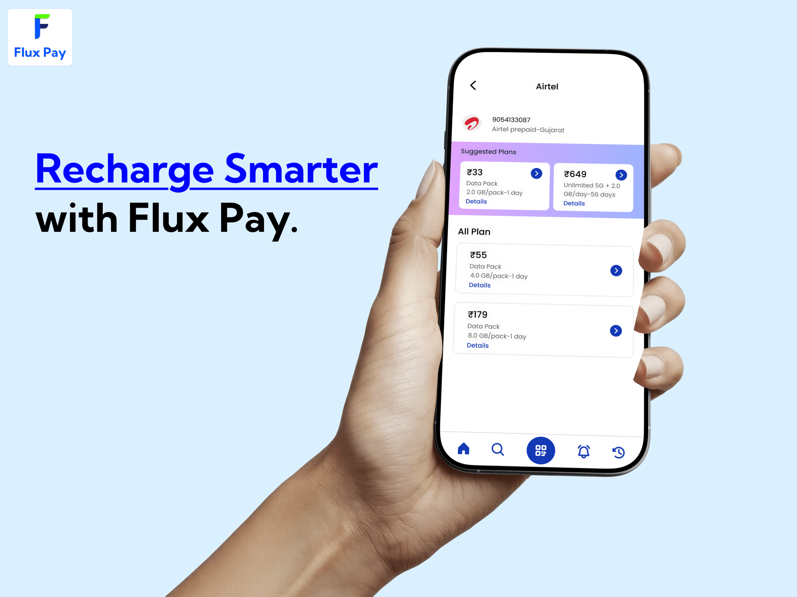
3. Wallet & Money Management
Add Money Flow
Payment Methods
-
- UPI
- Card
- Net Banking
Send Money
- To Contact
- To Bank Account (IFSC)
- To UPI ID
Withdraw to Bank
Bill Payments Dashboard
-
- Electricity
- Mobile Recharge
- DTH
- FASTag
Transaction Receipt
Transaction Filters
Download Statement
4. Cards Management
View Cards (Debit / Wallet Cards)
Add New Card
Card Settings
Freeze / Unfreeze Card
Set or Change PIN
Spending Limits
Virtual Card View
Card Usage History
5. QR / Scan & Pay
QR Code Scanner
Payment Confirmation
Add Note to Payment
Payment Success Screen
Payment Failure Screen
6. Profile & Settings
User Profile Home
Edit Personal Details
Verify Phone / Email
Security & Privacy
Change PIN / Password
App Theme Selection (Light / Dark)
Help & Support
Logout
7. Notification System
Notification List
Notification Detail View
8. Rewards & Offers (Bonus Module)
Rewards Dashboard
Refer & Earn
Coupons & Discounts
Component Library Included
Buttons
-
- Primary
- Secondary
- Icon Buttons
Cards
-
- Balance Cards
- Transaction Cards
- Offer Cards
Form Inputs & Fields
Popup Modals
Bottom Sheets
Toast Messages
Top & Bottom Navigation Bars
Wallet & Finance Icon Set
Charts for Spending Analytics
File & Packaging Structure
Style Guide Page
Components Library
All Screens Organized by Sections
Clickable Prototype Link
Readme & Usage Guide
Ideal For
Fintech & Wallet Apps
UPI & Payment Applications
Neobank & Digital Banking Products
Finance SaaS Platforms
Startup MVPs
Agency Client Projects
Compatibility
Designed for iOS & Android
Fully responsive layouts
Easy to customize and scale
Developer-friendly structure
Technical Specifications
✓ Allowed Usage
Use for personal and commercial projects
Use in client projects
Use for startup MVPs and production apps
Modify, customize, and adapt designs as needed
Use in paid or free applications
Include as part of a larger end product
✗ Not Allowed Usage
Reselling, redistributing, or sharing the UI kit as-is
Claiming the design as your own original work
Uploading the files to other marketplaces or websites
Using assets to create a competing UI kit product
Free distribution of files in any form
Frequently Asked Questions
Is Flux Pay suitable for real fintech apps?
Yes. Flux Pay is designed using real-world fintech workflows like KYC, wallet, payments, and card management.
Does this UI kit support both iOS and Android?
Yes. All screens are designed with a responsive grid system suitable for both platforms.
Are Light and Dark modes included?
Yes. Complete Light and Dark mode designs are included.
Can I customize colors, fonts, and components?
Absolutely. All elements are fully editable and follow a structured design system.
Is a prototype included?
Yes. A clickable prototype is provided for major user flows.
Does it include a component library?
es. A complete UI components and icon library is included.


Reviews
There are no reviews yet.